Friday, February 17, 2006

A sketchbook and some colours

In one of the Yahoo-groups I´ve joined recently we´re discussing art workbooks/sketchbooks and perfect watercolour palettes. I´m posting these pics to show my latest experiments in both areas. (Other pages from this book can be seen in earlier and coming posts, and it will be published in it´s entirety on my homepage once it is filled.)


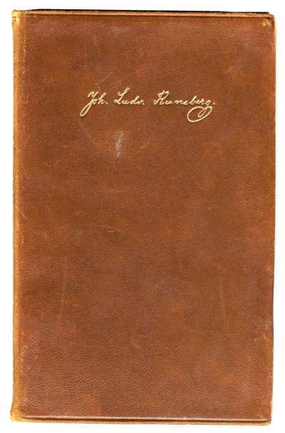
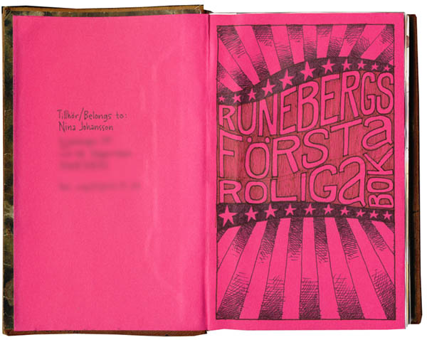
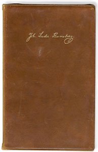
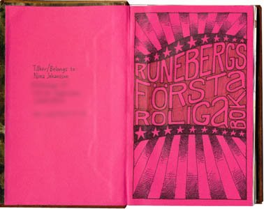
The book is a rebound leather cover of an old Runeberg novel that I ripped out (sorry, Swedish/Finnish literature-lovers, but have you ever tried actually reading his stuff??). The new signatures in it are joined together with a technique I found in “Making and keeping creative journals” (Suzanne Tourtillott, Lark Books), where you sew in linen tape across the spine of the text block for stability. Then I glued the whole text block into the cover with the pink endpapers. The book is quite small, 17,5 x12 cm (about 7 x 4.7 inches), and very sturdy. I´m actually not sure what paper I used in it, since I decided to use up paper I had left from another project. It goes well with pencil/pen/ink/watercolors, but is perhaps a bit thin if you want to get really messy with wet media.


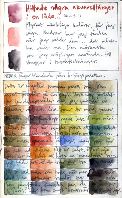
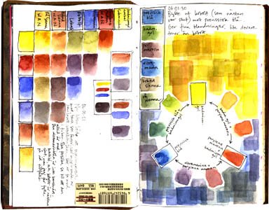
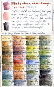
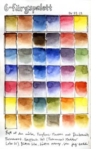
The first three colour tests are from my small watercolour palette with only six colours in it. I tried out various mixes first just to see the overall impression I got from the colours, and they looked perfect for landscape painting but I missed a clear orange and purple mixes so I changed the red color from perylene maroon to permanent madder lake light and now I´m pretty content with the mixes I get.
My small palette is always with me, I use it mainly with a Niji waterbrush, and I want it to be as versatile as possible without too many colours in it. (If you´re interested, the colours are cadmium yellow dark (schmincke), permanent madder lake light (rembrandt), ultramarine (don´t know what brand, I borrowed a tube from a friend to fill my little half pan…), phtalo blue (no brand here either), burnt sienna (winsor & newton) and raw sienna (winsor & newton).


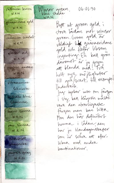
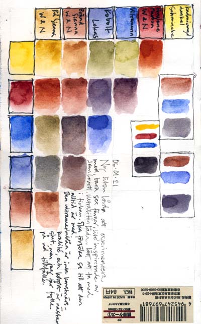
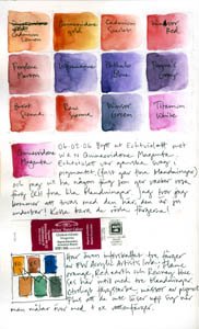
The other two colour tests are with my latest two additions to my bigger watercolour palette. I threw out green gold (it looks very much like quinacridone gold with a little blue shade in it, so I figured I didn´t really need it) and replaced it with winsor green blue shade (gives marvellous green and gray mixes, among others). And then I changed an echtviolett to quinacridone magenta – it´s impossible to “raise” a purple color to pink, but easy to mix a purple from magenta, so I think the magenta gives me a lot more possibilities. The mixes on these images are these two new colours mixed with all the others in my palette, just to get to know them better.

Tuesday, February 14, 2006

Learning from mistakes

Drawing is such a forgiving pastime. Make a mistake in your daily life and you may miss a train, lose your money or break an arm. Make a mistake with a drawing and all that happens is that you learn something. These are a few examples of not-so-excellent pages in my latest sketchbook, that still turned out okay in the end. Maybe not to the eye, but to my knowledge of drawing techniques, paper and observation.

The first image is a drawing I made sitting in a café outside Central Station in Stockholm. See the man with a line across his face? He wasn´t there when I started sketching up a few guidelines for the hotel building. Then suddenly he came and sat down right in front of me and I decided to include him in the drawing. I don´t mind things like this. The line across his face is a record of time – I drew the house first, then the man came along. I will remember this, no matter how unimportant it is, because of that line.
See the high hotel building in the background? In reality that hotel has another storey, but I really wanted to squeeze it into my picture frame, because I wanted the sign on the roof to be visible in my drawing. The way I had started the drawing, the roof would end up off my paper. So I cut one storey. And you know what? No one – not one single person – in Stockholm, except me and the staff at that hotel, knows that this building is supposed to be higher. People don´t know things like that, even if they´d live right across the street from the hotel. I got the composition I wanted, and everyone I showed the drawing to (Stockholmers (by the way, is that a new word?)) recognizes the view. So no problem.

The second example is drawn in a park, on paper that I included in my sketchbook because I thought it looked cool with the letters and pens printed on it. It used to be the first page of the drawing pad that I cut up to make this sketchbook. I thought the front was made of the same type of paper as the rest of the pad, but oh was I wrong. The ink I used in this drawing just got soaked into the paper, leaving bleak gray lines. The colors (Neocolor II crayons) reacted the same way. Nothing I did on this paper seemed to leave a clear mark, so the whole thing turned out a brown mess. Lesson learned: try a pen or two on paper that you´re not sure about before including it in your journal…

The third and last page was an attempt to make a patterned background with a stencil I made (I´m crazy about patterns, especially ones that look like insane seventies´ wallpapers), only the stencil moved and the color leaked in under it and got smeared on the page. Wonderful. But I don´t like to leave pages unfinished in my books so I decided I could use this one for general doodling, starting with a contour drawing of my hand. Which turned out okay, so I did another one beside it. Suddenly the page felt interesting so I kept drawing on it, and in the end I like the composition of it all. I don´t think that sketchbook pages have to look good, that would just limit my way of drawing, but even so I still find it hard to give up too soon if a page looks like crap. And I´ve noticed so many times that if I just keep working I can usually turn mess into something interesting.

My sketchbooks contain many pages of mistakes but I kind of like them. Those pages are the ones that I have to spend the most time and effort to “save” and they are definitely the ones I learn most from. Embrace your mistakes, they are good for you!

Monday, February 06, 2006

EDM challenge no. 53

Now this was a real challenge ... how often do you sit down to take a good look at your own mouth? I have drawn self portraits before, but never concentrated on one single feature from different angles like this. Isn´t it great with all the irregularities we all have in our faces, how we are actually NOT symmetric at all although we often tend to think we are?