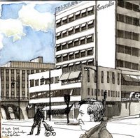
The first image is a drawing I made sitting in a café outside Central Station in Stockholm. See
 the man with a line across his face? He wasn´t there when I started sketching up a few guidelines for the hotel building. Then suddenly he came and sat down right in front of me and I decided to include him in the drawing. I don´t mind things like this. The line across his face is a record of time – I drew the house first, then the man came along. I will remember this, no matter how unimportant it is, because of that line.
See the high hotel building in the background? In reality that hotel has another storey, but I really wanted to squeeze it into my picture frame, because I wanted the sign on the roof to be visible in my drawing. The way I had started the drawing, the roof would end up off my paper. So I cut one storey. And you know what? No one – not one single person – in Stockholm, except me and the staff at that hotel, knows that this building is supposed to be higher. People don´t know things like that, even if they´d live right across the street from the hotel. I got the composition I wanted, and everyone I showed the drawing to (Stockholmers (by the way, is that a new word?)) recognizes the view. So no problem.
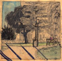
The second example is drawn in a park, on paper that I included in my sketchbook because I
 thought it looked cool with the letters and pens printed on it. It used to be the first page of the drawing pad that I cut up to make this sketchbook. I thought the front was made of the same type of paper as the rest of the pad, but oh was I wrong. The ink I used in this drawing just got soaked into the paper, leaving bleak gray lines. The colors (Neocolor II crayons) reacted the same way. Nothing I did on this paper seemed to leave a clear mark, so the whole thing turned out a brown mess. Lesson learned: try a pen or two on paper that you´re not sure about before including it in your journal…
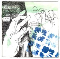
The third and last page was an attempt to make a patterned background with a stencil I made
 (I´m crazy about patterns, especially ones that look like insane seventies´ wallpapers), only the stencil moved and the color leaked in under it and got smeared on the page. Wonderful. But I don´t like to leave pages unfinished in my books so I decided I could use this one for general doodling, starting with a contour drawing of my hand. Which turned out okay, so I did another one beside it. Suddenly the page felt interesting so I kept drawing on it, and in the end I like the composition of it all. I don´t think that sketchbook pages have to look good, that would just limit my way of drawing, but even so I still find it hard to give up too soon if a page looks like crap. And I´ve noticed so many times that if I just keep working I can usually turn mess into something interesting.
My sketchbooks contain many pages of mistakes but I kind of like them. Those pages are the ones that I have to spend the most time and effort to “save” and they are definitely the ones I learn most from. Embrace your mistakes, they are good for you!


4 comments:
Mistakes are a wonderful learning tool, but, I think these are just great! You really captured the scene so well. I call these real honest sketches!
We are our own worst critics!
Nina, I like seeing these very much. You know, I find the one with the hands more interesting with the stamp than had it not been there.
And you are absolutely right about the pages with mistakes being valuable. They're the ones we learn the most from, not just the pretty or safe ones.
Nina -- these really are very good, you know! I wouldn't have thought of the line across the man's face as a mistake -- it just seems like part of the drawing.
:-)
I don't see any mistakes in the first drawing! With the building, you've just made an editing decision, to alter spatial elements to suit your own artist's purposes. Don't we do this all the time in drawing and painting? And I really like the line you've left behind the man's face. I love seeing traces of the process of drawing in a piece more than I like an ultrafinished, hyperpolished drawing. Your third page is so interesting! A great example of process as art! Wonderful stuff, as always.
Post a Comment